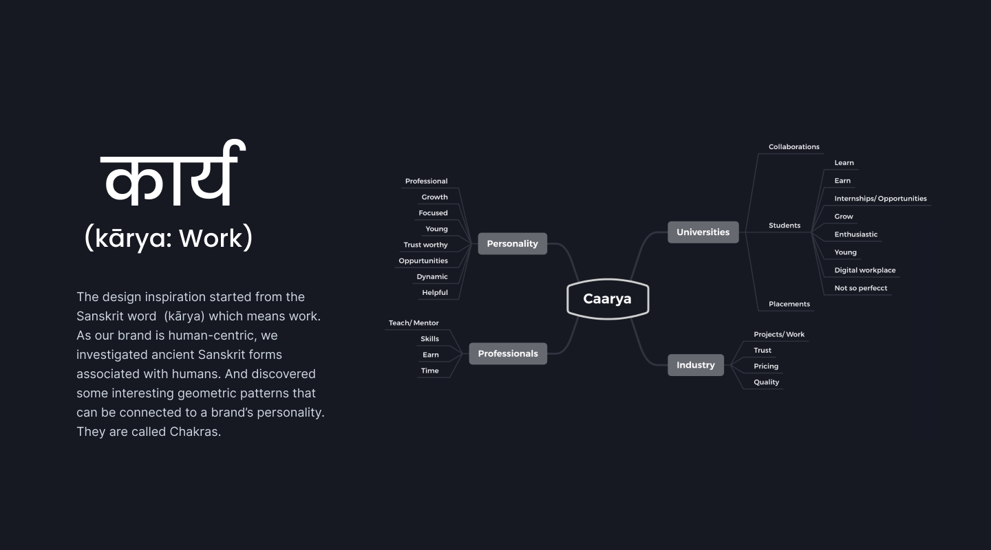
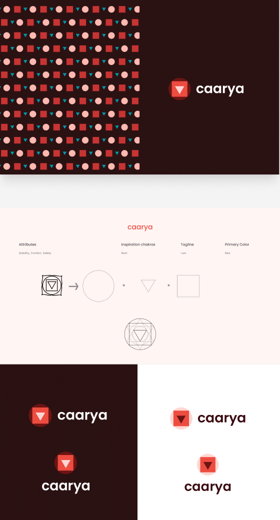
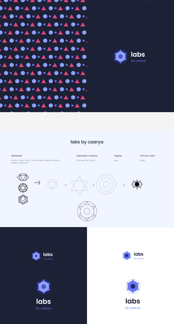
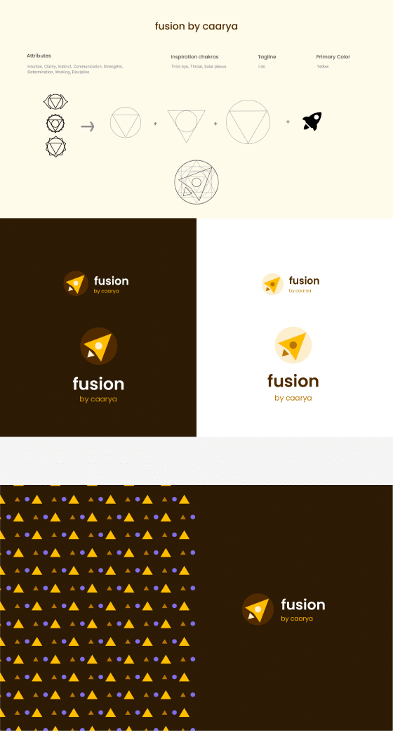
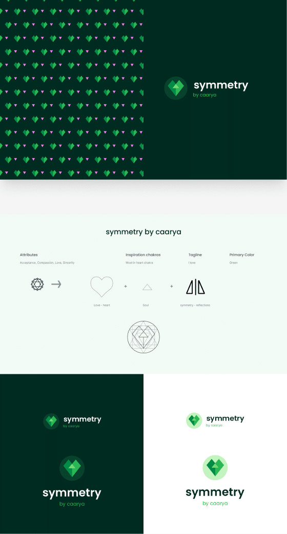
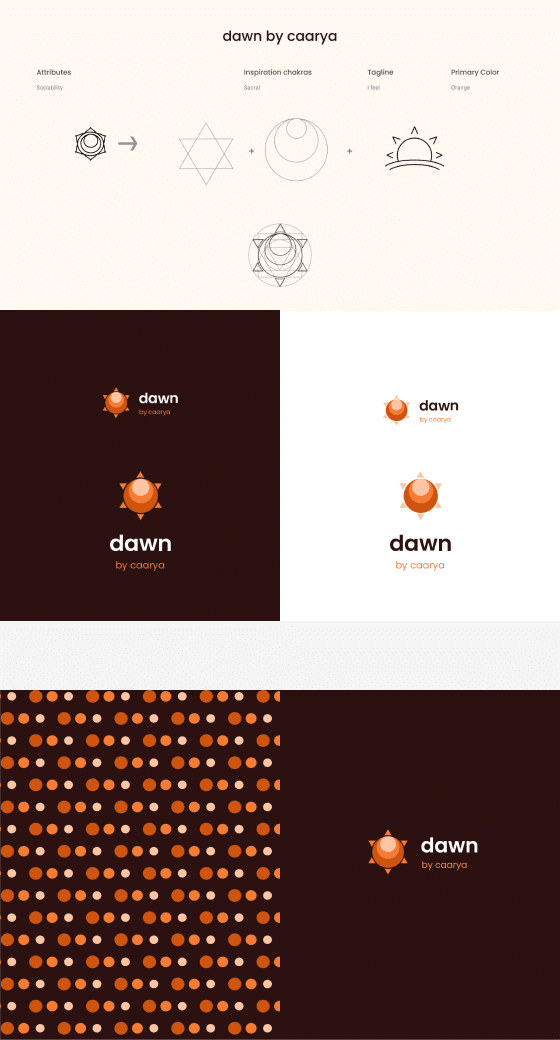
Caarya is an ecosystem of Indian students, startups and promoters who aim to supplement knowledge, skills, values, beliefs, habits and attitudes with learning experiences. Caarya has multiple entities/ sub-brands with different goals and objective.
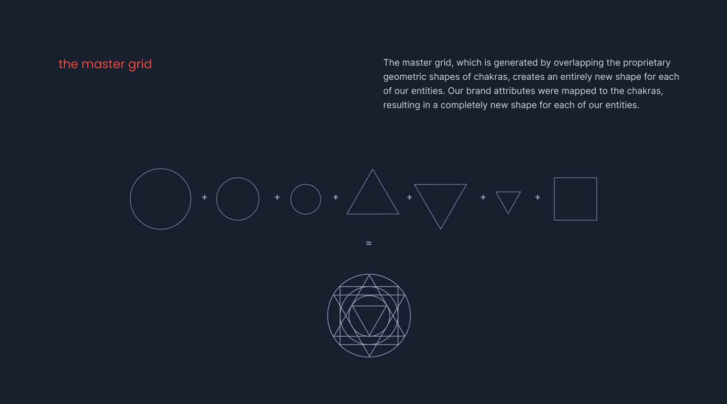
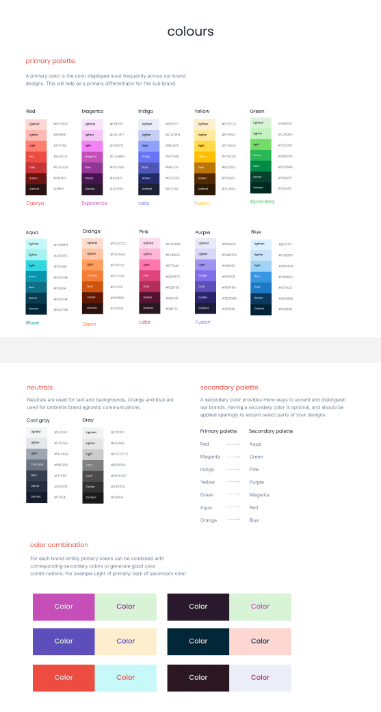
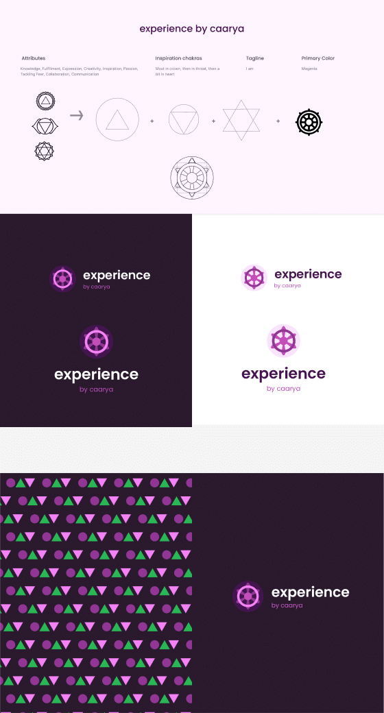
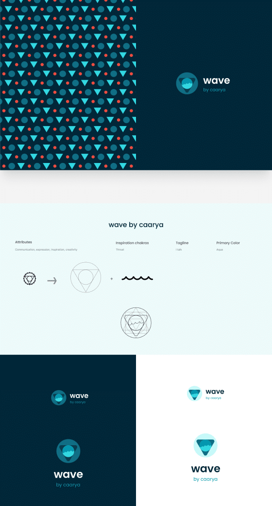
The design challenge was to create a visual language that would allow the audience to recognize the unity with the parent brand and distinguish the entities from each other.
Prior to working with me, the client had attempted working with two other designers. I had to convince him of a strong strategy from a storytelling and visual language standpoint. I used examples from MIT Media Labs, Firefox, and other brand design systems.
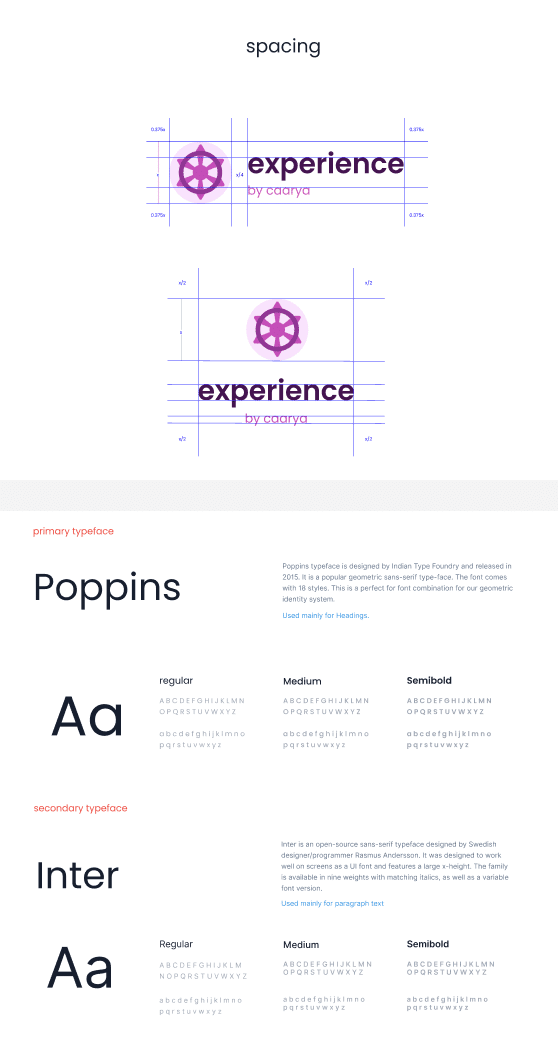
Brand guidelines are comprised of colours and combinations for various entities, Typography, Patterns and spacing systems.
For all of you who want meaningful logos, owaiz is your guy. Wonderfully Insightful with empathy towards the customer requirements, what stand s out for me is the effort that owaiz puts into understanding the requirements and delivering a logo that speaks for the brand.
